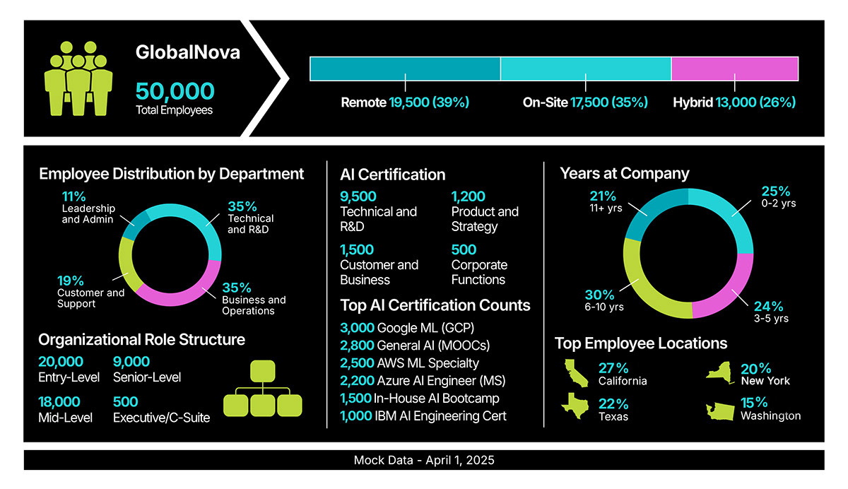
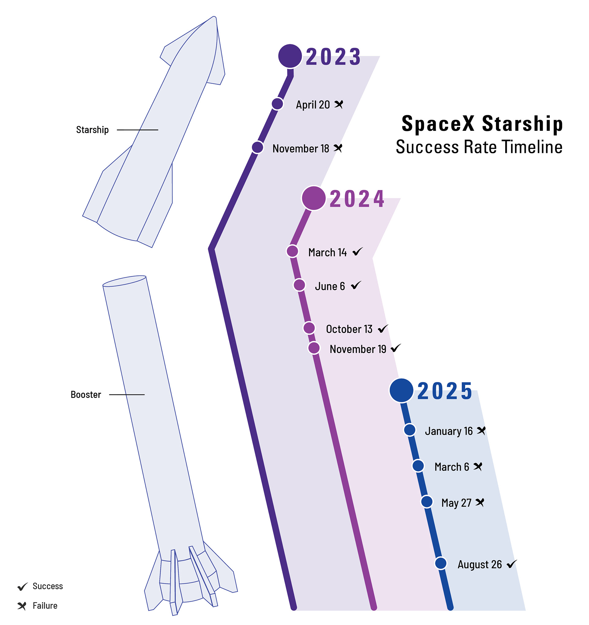
These mock data visualizations are a series of self-directed studies exploring how design can bring clarity and impact to complex information. The goal was to experiment with layout, color, typography, and hierarchy to enhance readability and storytelling across different chart types. These studies highlight my ability to translate data into visually engaging, purpose-driven graphics suitable for dashboards, presentations, reports, articles, and brand content.